做RWD網站,發現用Css sprites的圖片沒辦法自適應,調background-size也不行(因為它會整張縮放)常常之後又改成img,實在太麻煩了!
後來我看這篇,終於實作出來了,感恩師父,讚嘆師父!
一般背景圖片要響應式,設寬度100%,再用高除以寬,得出來的值做成padding-top。(不設height)
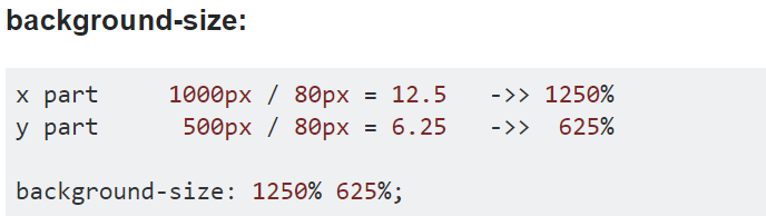
首先要算出background-size再去算background-position
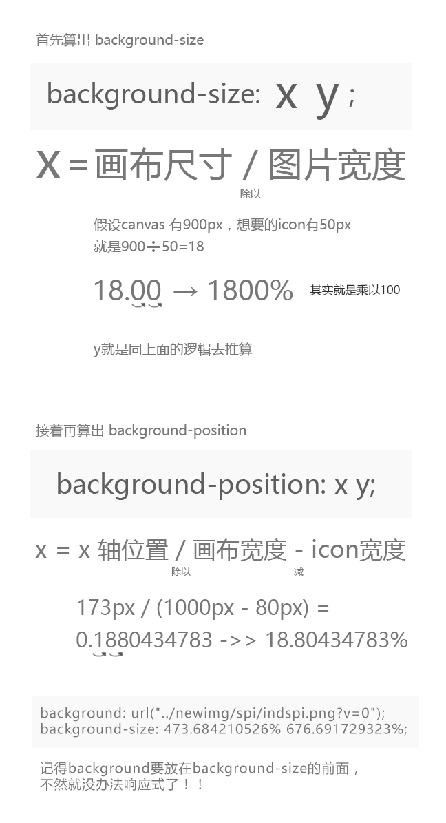
y就是同上面的逻辑去推算
xpos位置/(canvas寬度-icon圖片寬度)
173px / (1000px – 80px) = 0.1880434783 ->> 18.80434783%
1000px is the width of the background image (sprite)
80px is the width of displayed image
173px is the absolute x-coordinate of the displayed image.
【參考連結】
responsive sprites / percentages
記得看ChillyPenguin寫的,她的才正確