import React, { Component } from 'react'
import Select from 'react-select'

const options = [
  { value: 'chocolate', label: 'Chocolate' },
  { value: 'strawberry', label: 'Strawberry' },
  { value: 'vanilla', label: 'Vanilla' }
]

const MyComponent = () => (
  <Select options={options} />
)menuIsOpen={true}貼上這個可以每次都是展開的,要inspect比較方便
blurInputOnSelect這個props可以讓選擇後失去焦點,不會有focus效果
要客製化style的話,可以寫一個客製化風格物件,
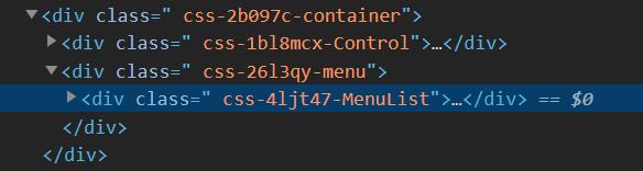
文件教學在這。另外可以看DOM結構的classname來對應
const customStyles = {
  option: (provided, state) => ({
    ...provided,
    borderBottom: '1px dotted pink',
    color: state.isSelected ? 'red' : 'blue',
  }),
  control: () => ({
    // none of react-select's styles are passed to <Control />
    width: 200,
  }),
  singleValue: (provided, state) => {
    const opacity = state.isDisabled ? 0.5 : 1;
    const transition = 'opacity 300ms';

    return { ...provided, opacity, transition };
  }
}

  const App = () => (
    <Select
      styles={customStyles}
      options={...}
    />
);不過做這個我覺得也許可以搭配Storybook。