https://www.sitepoint.com/jquery-each-function-examples/
在編輯文章的時候,打Ctrl + Enter,可以做出<br>的效果,不會空距好大一行。如果是直接按Enter的話,就會是另一個<p>的tag
日語學習群
https://t.me/nihongoLearn
日劇日音
https://t.me/JapaneseShows
桌遊群
https://t.me/BoardGamePlaying
奧客麥來亂
https://t.me/obnoxiouscustomers
台灣新群組/新頻道廣播站
https://t.me/Topics_TW
群組導航 – 分享/推廣
https://t.me/navi_group_share
telegram貼圖群
https://t.me/StickerGroup
telegram貼圖群
https://telegram.me/sticker_tw
女性向ACG聊天群
https://t.me/otomecafe
IT人的生活日常
https://t.me/it_normal_life
爬山群
https://t.me/mountainClimbingLove
GIF群聚地
https://t.me/GIFgroupTW
telegram貼圖分享群
https://telegram.me/sticker_tw
喵星人樂園
https://t.me/Cats_paradise
每日無數貓
https://t.me/miaowu
愛看書的人加的群
https://t.me/+RMqij843NddzrmRW
單身群
https://t.me/joinchat/FRVUFlCK7TmTSvp2In162w
內湖群
https://t.me/+SYpUFcwS-ulk0fhX
中山區
https://t.me/+Rwq0SYO2i0QdbXHp
重訓群
https://t.me/+EEr8tsdnUF7kCMQV
文具群
https://t.me/tw_stationery_holic
Telegram 群組推廣
https://t.me/tgroupsforzh
TW 自由潛水 討論、潛伴、裝備
https://t.me/TWfreediving
每日沙雕牆
https://t.me/woshadiao
喵+正妹
https://t.me/MeowBeauty
8cat Moe 二次元基地
https://t.me/Moe8c
Animated Stickers
https://t.me/AnimatedStickers
邊緣人厭世群聚地
https://t.me/misanthropeTW
單身好朋友
https://t.me/+xQqCT04FR7Q4ZWI9
女人變有錢
https://t.me/womenberich
Hello Kitty
https://t.me/+Rx2u5BKgl0MiP7i8
(松鼠交流,二手買賣可)台灣機械鍵盤/
https://t.me/KBTalkingTW
MOPCON
https://t.me/mopcon
高雄的程式聚會↑
哈日劇
https://t.me/hotjpdrama
三立新聞網官方頻道
https://t.me/setnews2020
自由時報
https://t.me/LTNnews
中央社
https://t.me/cnanewstw
Ctrl + Alt + Shift + E
快速将目前打开的图层合并并复制出一份出来
选笔刷或橡皮擦,按住Alt+滑鼠上下左右拖曳,可以调整笔刷大小或Hardness
&:-webkit-autofill {
-webkit-box-shadow: 0 0 0 30px black inset;
-webkit-text-fill-color: #eec452;
}
在input后面加这个,可以盖掉自动完成(记忆帐号密码)的样式
&::-webkit-input-placeholder { /* Chrome/Opera/Safari */
  color: #fff;
}
&::-moz-placeholder { /* Firefox 19+ */
  color: #fff;
}
&:-ms-input-placeholder { /* IE 10+ */
  color: #fff;
}
&:-moz-placeholder { /* Firefox 18- */
  color: #fff;
}
&:-webkit-autofill {
  -webkit-box-shadow: 0 0 0 30px black inset;
  -webkit-text-fill-color: #fff;
}
这段可以连同placeholder一同变色,加在input里
CSS解决英文不会断行的问题
word-wrap: break-word;
<span>不能包住<a>不然网页会整个挂掉
假如mission__play这些表单
li要有按钮的话,加在li上加个class 叫bind,如下图:

把PSD的尺寸改成375宽,就是iphone7上需要实际字元等pixel的大小
弹窗的范本在MUIModelv2.js里面改,各种都有
input直接一个class readonlyinput就可以变成readonly
网页的连结,到mobile/js/MobileManage.js改
.改纪录的table的html相关,到MobileGridnew.js改
(table是从这个檔案范本化出来的)
.檔名后面直接加个2就好了,不用v2
<div class=”header-margin”></div>
不需要这个,直接设body 有padding-top就好了
mui-btn mui-btn–orange
mui的按鈕這樣分樣式,我也可以分為:
cbetbtn cbetbtn–twin
twin 表示兩個並排
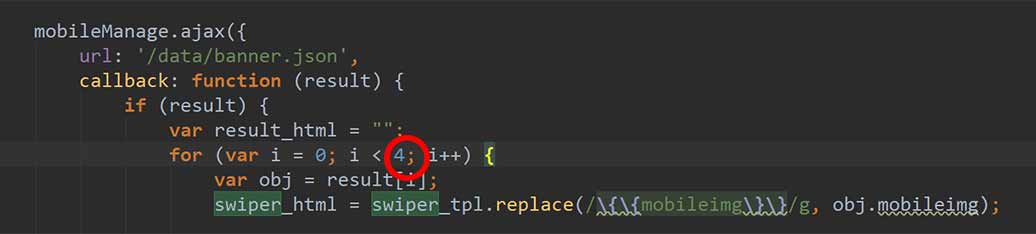
首頁的輪播圖出不來,可能是這邊的問題
WAP的页面应该都要用div.main-wrap包起来,
body设定overflow: hidden;
这样子才不会有轴卷出现,又可以上下滑动
‘<div onclick=”window.location.href=\’/app/love.jsp?loveType=’+ data.lovein[i].platform +’\'”>’,
因為 herf= 後面通常是接 “” 但是那行語法是在js裡面
而整段已經有使用”在開頭跟結尾
所以herf後面的雙引號改由\’代替 中間的 js語法再用”跳出來
小七開始賣各種草莓商品,巧克力攤也沒了QQ
我最愛的Brookside巧克力…以後只能到COSTCO買了
var luna = “”;
if ( luna = stupid ){
alert(“true”);
} else{
alert(“Luna is genius”);
}
這裡的等號只有一個,它會直接把值指定給luna。 要用二個等號去比對。
想選擇一樣的tag,結果找不到的情況:
<header id=”luna-header” class=”header luna-header”>
var header = $(‘#luna-header’);
var header = $(‘body>header[class=”luna-header”]’);
第一個找的到,第二個找不到
第二個改成 $(‘[class=”header luna-header”]’) 就可以找得到了
因為class attribute是整串
不然就要用這個 $(‘[class~=”luna-header”]’) 包含那個字 https://api.jquery.com/attribute-contains-word-selector/